Projects Completed for my Senior Praticum
-
Elevator Video
Completed for my senior practicum, we were required to create an elevator pitch for ourselves and our abilities. The goal of this video is to project our personality, explain our talents, and create a desire within the viewer to know more about ourselves in a short and concise style.
-
Web Essays
Throughout my senior year of college, we were required to complete two essays that analyze digital multimedia objects. The first one is focused on Shelley Jackson’s “My Body”, and the second is focused on hybrid art through Kalle Lasn’s ‘Design Anarchy’
-
Exploring Multimedia
Exploring multimedia through visual, sonic and textual projects.
Elevator Video
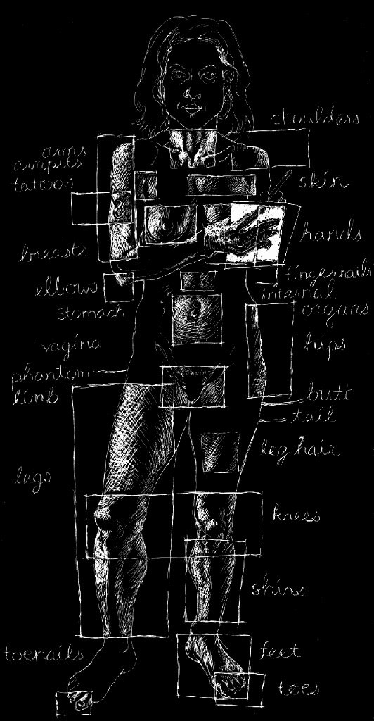
Essay 1: Multimedia Objects
Shelley Jackson “My Body”
Shelly Jackson’s multimedia art entitled, ‘My Body’ is a poetic personal coming-of-age experience displayed as an exploration of her body, memories, and emotions through an interactive online drawing. Each part of her body the viewer interacts with takes them to a page with a story related to that specific subject that is personal to Jackson’s experiences while growing up. The seemingly endless hyperlinks take the viewer through a harmonious and random sequence of stories from Jackson’s life. According to Lev Manovich’s definition of a multimedia object from his essay, Database as a Symbolic Form, Jackson’s online artwork is considered a multimedia object. Manovich states that multimedia objects, “appear as a collection of items on which the user can perform various operations: view, navigate, search. The user experience of such computerized collections is therefore quite distinct from reading a narrative or watching a film or navigating an architectural site” (Manovich, 1998). ‘My Body’ is an object-oriented and relational database on which the user can perform various operations such as viewing and navigating through the image and the text; also known as the interactive narrative. Manovich states that a multimedia object requires the ability of the user to be able to perform these such operations, while the word “narrative” becomes an all-inclusive term for the database as a whole. Although Jackson’s piece does have characters and a story, it lacks a beginning, middle, and end or other organization as a sequence. However, multimedia has come to be a collection of individual items where that have the same significance to one another. This piece is based on a web page that includes HTML hypertext, blocks, text, images, and links to other pages and can therefore be considered a new media database. This multimedia object only lacks an option for the user to “search”. Rather, the viewer must explore all the links and images in their unique pattern. Jackson uses this HTML hypertext to focus on her personal experiences and relationships between her identity and her body, mainly emphasizing her relationship with her body when she was a young girl growing up and going through many bodily changes during puberty. The feeling of alienation within one’s own body is clear, a feeling that many pubescent teenagers endure and one that Jackson narrates through this piece of art. Manovich also touches on the algorithm of a multimedia object, and how media like video games have a path for the user to follow to successfully proceed through the game. Jackson’s piece strikes me as interesting in terms that it rejects this idea, and allows each viewer to explore in their own way, further pushing the narrative of personal exploration in not just her artwork, but also in growing up, puberty, and one’s own identity.
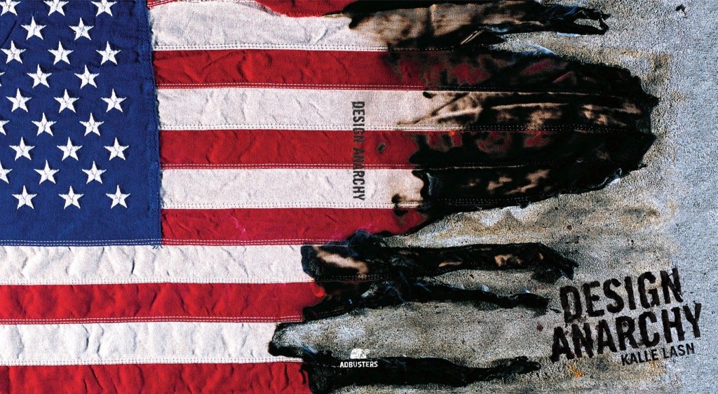
Essay 2: Hybrids
Kalle Lasn’s ‘Design Anarchy’
The idea of hybrid art depicts a form of art that is created at the intersection of art, music, idea, and technology. When artists create pieces that connect art to another factor of our world, the meaning can change according to what we want to discover or influence both factors in an evolutionary way. Kalle Lasn’s Design Anarchy depicts a modern example of hybrid art through its connection between art, culture, and media. Anarchy is a state of disorder due to absence or non-recognition of authority or other controlling systems, Lasn’s idea of anarchy being created when this hybrid occurs is significant to this piece as a whole. Considering this on a cultural level and connecting it to the practice of Graphic Design, one can imagine that design anarchists are being asked to start to doubt standard practice and move away from the authority that dictates what should be created with their work. This idea is reinforced by the author when he states, “our aim is to topple existing power structures… we will change the way information flows” and “the way the [industries] set their agendas” (Lasn, Design Anarchy). This is in exact conflict with the majority of design practice, as the idea of design is significant for the aesthetics that coincide with a capitalistic mindset of the country. Lasn shows in his book that the new political avant-garde is comprised of graphic designers as those who will bring capitalism its strongest criticism in a truly anarchic way. The book creates a technical event that forces the viewer’s mind to take notice of the images and search for meaning, even if there is none for anyone mindlessly following the consumer cycle, dulled to one’s sense of self and place in the world. By confronting mass consumption and blind devotion to corporate identities, Lasn can show how graphic design is prevalent and has an impact on everything we do, see, and buy. Design Anarchy reproduces numerous urgent reimaginings of well-known advertising campaigns from Adbusters as well as other activists’ texts and visuals as a type of graphic design manifesto. Design Anarchy serves as a textbook introduction to culture jamming, the act of interrupting the flow of information long enough to distrust the spectacle, encourage the jolt, and enable the process of awareness. Design Anarchy is intended to spark a fire under the uncritical acceptance of being fed propaganda from the news, fashion, beauty, or food industries, as well as others. This was made to help “de-market” ourselves, and to refuse to accept having dependence on commercial messages to make meaning. Rather, to make meaning through spontaneity. When Lasn writes, “Don’t work for corporations that want you to lie for them,” or states, “Put your commercial here” across pages, he makes it quite obvious what his position is. For designers and customers, it serves as both a motto and a warning especially since both designers and customers, according to Lasn, are to blame for the destruction and restoration of the mental environment.
Exploring Multimedia
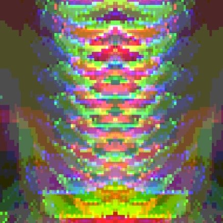
GLITCH ART
The idea of glitch art is to create unexpected artistic creations through the use of uncontrolled “glitches”, photo manipulation, and moving beyond the idea that faults (or glitches) in images are actually faults. The aesthetic is inspired by computer glitches, and the goal is to expose something new within the image that may have otherwise never been exposed without the glitch. By manipulating the technology and tools artists are given, the hope is further expand our vocabulary for communicating with each other. It also can be interpreted as a type of “anti-art”, refusing to follow basic aesthetic guidelines in order to find beauty in this different perspective. Below are a few examples of my personal glitch art, all created and distorted in a unique way to create an entirely new image from what it once was.

FLOWERGLITCH:
Originally a close up photo of a flower, I used Photoshop to distort and abstract the image. After duplicating the image three times and lowering the opacity on all three, I edited each layer individually. On the first, I drastically sharpened the image. For the next layer, I used the burn and dodge tools to alter the shadows and intensity in the colors. Finally, I added a filter titled, “glow edges” to create the luminosity effect. Last, I moved each image slightly to create a type of movement blur to give the image an appearance of being “shaken”.

KOMODOGLITCH:
For this glitch, I used photomosh.com to alter the image. Originally a digital drawing that I created using Procreate, I pixelated the image both vertically and horizontally. Next, I posterized the image, which is to display the image with a limited number of tones and colors, which “glitched” the original colors that I used in my drawing and changed the tone, especially in the hair, which was originally blonde. Additionally, I altered the hue and saturation manually to create a more intense contrast. Finally, I “smeared” the image, which is an effect on Photomosh, this gave the image the look that it was almost melting.
HANGINGGLITCH:
This photo was originally taken at the Morikami Japanese Botanical Garden in Boca Raton, Florida. This hanging sculpture was made entirely of paper, paying homage to the Japanese culture around paper art and Origami. This was also created using Photomosh, where I began with pixelating and posterizing the image. Next, I used the dot matrix, which creates a layer grid of dots on top of the image. Finally I shifted the RGB layers, which distorted and moved each red, green, and blue layer in order to create the distorted effect seen in the image.
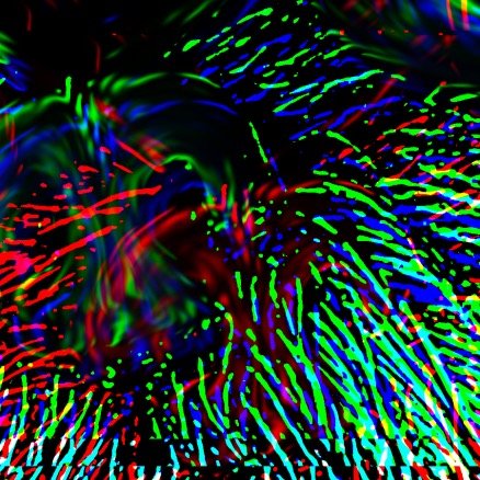
SPROUTGLITCH:
This photo was originally a close up of a dog (endearingly named Sprout, hence the title of the glitch). This glitch was created in Photoshop. I began with sharpening the image, so that the fur would lose its soft look and create a harsher quality. I also added noise to the first layer as well as beveling and embossing the image. This adds rounded edges and shadows to give a 3D impression. Finally, I created three additional layers, titled red, green, and cyan. In each layer, I removed either the red, green, or blue in the layer to create a layer that has a filter of color over it. I finally moved each layer slightly up or down in order to see each individual layer and create a chromatic effect.
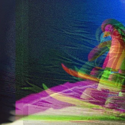
PENGUINGLITCH:
For this image, I used DALL-E 2, the new AI system that can create realistic images and art from a description in natural language. I prompted the DALL-E to create, “a Claymation penguin snowboarding down a hill at night”. After creating the image, I used Photoshop to “glitch” it. On the first layer, I sized it up, lowered the opacity, sharpened, and smudged it. On the next layer, I added the “glow edge” effect. Next, I added two new layers. On the first, I beveled and embossed it as well as making the layer green. The final layer I made purple, both of these were made by removing one or more of the red, green, and blue from the RGB properties. I ended by moving around each layer and altering the opacity in order for the viewer to see each layer, creating the impression that the photo has glitched to create multiple versions of the same image stacked on top of each other.
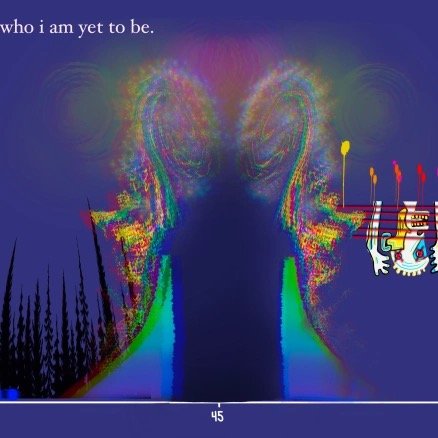
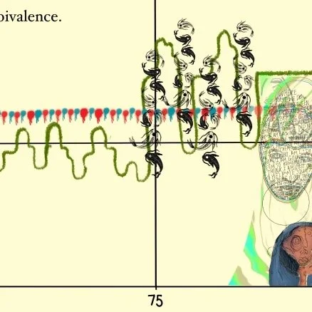
SONIC: MUSIQUE CONCRETE PROJECT
Musique Concrete is a type of music composition that utilizes recorded sounds that are then modified to create a sound collage. During my experience creating this collage, I collected audio from live music, movies/tv shows, and natural white noise and background noise from places such as my home, the train, and the classroom. After cutting all of these sounds into small “snapshots”, I then arranged them together using Audacity. With the intention of exploring sound, I used this software to both stretch and compress the snapshots as well as use effects such as distortion and reverb. I used the Paulstretch effect to stretch the audio to an extreme level, and then attempted to compress the stretched audio by increasing both pitch and speed. This created an effect that gave my audio a “glitchy” aesthetic in some places. This altered the sounds completely, and resulted in an entirely new and foreign snapshot. For example, most of the third section was sampled from a jazz band. After stretching some areas, compressing others, and changing both pitch and tempo, it turned into a high pitched, fast paced robotic sounding sample. The action of distorting and modifying sounds from the natural world open up an entirely new body of auditory exploration that was hidden inside the original sound the whole time. I accepted this idea into my personal exploration, and allowed for my audio to essentially create itself. Although I did modify all the sounds, I did very little organizing of them. Rather, I put all the snapshots together in a fairly random order and modified them without listening to it. Only after I had created the majority of the song did I listen to it, and this allowed for a very organic, non-structured rhythm to occur, which I feel was my main goal of creating this Musique Concrete. After this, I used Procreate to digitally draw a contemporary artistic graphic score to go along with my audio. Details of this experience can be found below!
After creating my Musique Concrete, I began working on a visual score that could aid listeners and viewers in the experience. The basic organization of the score shows the time moving on the X-axis, while pitch is moving on the Y-axis. Additionally, I mainly associated cool, darker colors with lower pitched sounds and warm, brighter colors with higher pitched sounds. I used Procreate, a digital drawing app on the Ipad to create my score. This allowed me to have complete artistic freedom, as my goal was to express the sound in an emotional way, as my audio has high tonal and mood contrasts in many areas. To go with this range of emotion seen in both my visuals and audio, I chose to give this project the overarching theme of the feeling of ambivalence. Ambivalence is defined as the state of having mixed feelings or contradictory ideas about something or someone. I felt as though this idea was something that I had kept in my mind while creating this, and it can be heard in the ranges of tone in the audio. Finally, I added a brief narration at the top of each section to further guide the viewer/listener through my focus in this project. Below is a slideshow of each section of my score for additional in-depth viewing.